I'm in a pretty serious relationship, and it's with the DMC six strand embroidery floss colors. Actually if this were Facebook, I'd say "It's Complicated". The DMC colors are my palette, but unlike a painter if I can't find the color I have in my mind, I can't mix a new one. I'm limited by the 454 colors they produce. So sometimes it's frustrating when the color in my head doesn't exist in thread form. But then there are the colors I find I go back to again and again and again. My all-star team. I thought I'd start a little series of posts celebrating these colors, and how I've used them!
First up is one of my all-time best hitters, DMC 718. The official name of this color is apparently "Plum". I've never seen a plum that comes close to the intensity of this color, but it's almost exactly the same color as the bougainvillea that blooms all over Los Angeles:
 |
| source: wikimedia commons |
 |
| source: wikimedia commons |
 |
| source: wikimedia commons |
718 is a clear, intense magenta that "vibrates" very strongly against the complement of purple, which is a yellow-orange. That's how I've used it here in my Forest design (718 is the right side of the "popsicle" shaped tree, the branches of the big round tree, and you can see a bit of it in the upper right):
 |
| detail - Forest by Satsuma Street |
I used the same palette in my companion design to Forest, Autumn Bird. I especially love 718 next to a nice turquoise or blue, as seen here on the far right:
 |
| detail - Autumn Bird by Satsuma Street |
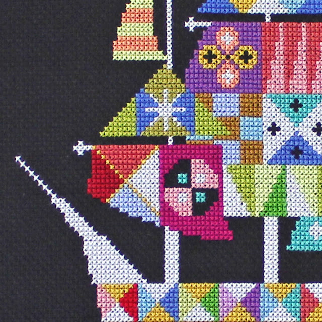
718 is basically a pure hue, meaning it doesn't have any white or grey added to create a tint or shade. So I also love how this color looks against both black and white, and here you can see it in the center sail of my pirate ship design, Voyage. The complement of magenta is yellow-green, which I used above and to the right of it:
 |
| detail - Voyage by Satsuma Street |
In my Elephant Biscornu, DMC 718 takes on a warm Morrocan vibe when paired with orange, pinks, and light turquoise:
 |
| Elephant Biscornu by Satsuma Street |
Here it's the saucy head of the momma bird in Happinest. Just as with the black background, the raw linen color is a nice neutral that doesn't affect the perception of 718:
 |
| detail - Happinest by Satsuma Street |
If you don't have DMC 718 on hand, the closest match is DMC 917, which they call "Medium Plum" (go figure). They are almost indistinguishable as far as I'm concerned. I use 917 constantly too, including here in the Pretty Little Hong Kong design, again paired with teal and gold:
 |
| detail - Pretty Little Hong Kong by Satsuma Street |
So, that's my little homage to DMC 718! It's fun to look back over my designs and see the same color used in many different ways.
Next time: DMC 3819!
xoxo
Jody


Really interesting to hear your take on colors! I love this shade, as well as the ones that tip more into purple.
ReplyDeleteVery neat essay. I love your designs. I have completed 9 of your designs so far and loved them all. It's cool you started with 718 because it is probably my favorite color you use! ~ Devan
ReplyDeleteLove this series already. Understanding your process makes stitching the beautiful results all the more fulfilling!
ReplyDeleteI loved this! Do you have a good source for shade substitutes?
ReplyDeleteThanks Cindy! I don't know of a list of substitutes, but there must be one out there somewhere!
DeleteI really enjoyed this post and look forward to the next one. There are definitely some colours you just associate with certain designers. 3041 and 3042 will be forever Teresa Wentzler to me and Just Nan uses the same palatte for most of her Hallowe'en designs.
ReplyDelete918 is a great colour and very distinctive too.
Interesting...
ReplyDeleteIt reminds me that although DMC have some shades that are very similar, they completely lack some colours, even with 454 of them! I refer to blues. I keep looking at the colour card and I am convinced that when it comes to pleasant light blues the choice is very limited and certain shades are absent. All i see is dusty light blue, or pale, changing to very bright and electric... and nothing in between. it's just frustrating
Although truth be told they did add 16 new colours (3years ago!,but still not widely available) with nice bright blue among them which may have filled in the gap a bit
Thanks for listening :)
Wow, what an awesome article! I have to check my stash at home, but I'm pretty sure I don't have 718. I'm new to cross stitch, but you're definitely one of my favorite designers. I'm practicing smaller projects before I can work my way up to your beautiful designs! I love your color palettes, so vibrant and cheery!
ReplyDelete