I'm in a pretty serious relationship, and it's with the DMC six strand embroidery floss colors. Actually if this were Facebook, I'd say "It's Complicated". The DMC colors are my palette, but unlike a painter if I can't find the color I have in my mind, I can't mix a new one. I'm limited by the 454 colors they produce. So sometimes it's frustrating when the color in my head doesn't exist in thread form. But then there are the colors I find I go back to again and again and again. My all-star team. I thought I'd start a little series of posts celebrating these colors, and how I've used them!
First up is one of my all-time best hitters, DMC 718. The official name of this color is apparently "Plum". I've never seen a plum that comes close to the intensity of this color, but it's almost exactly the same color as the bougainvillea that blooms all over Los Angeles:
 |
| source: wikimedia commons |
 |
| source: wikimedia commons |
 |
| source: wikimedia commons |
718 is a clear, intense magenta that "vibrates" very strongly against the complement of purple, which is a yellow-orange. That's how I've used it here in my Forest design (718 is the right side of the "popsicle" shaped tree, the branches of the big round tree, and you can see a bit of it in the upper right):
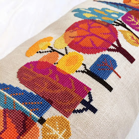 |
| detail - Forest by Satsuma Street |
I used the same palette in my companion design to Forest, Autumn Bird. I especially love 718 next to a nice turquoise or blue, as seen here on the far right:
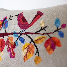 |
| detail - Autumn Bird by Satsuma Street |
718 is basically a pure hue, meaning it doesn't have any white or grey added to create a tint or shade. So I also love how this color looks against both black and white, and here you can see it in the center sail of my pirate ship design, Voyage. The complement of magenta is yellow-green, which I used above and to the right of it:
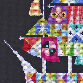 |
| detail - Voyage by Satsuma Street |
In my Elephant Biscornu, DMC 718 takes on a warm Morrocan vibe when paired with orange, pinks, and light turquoise:
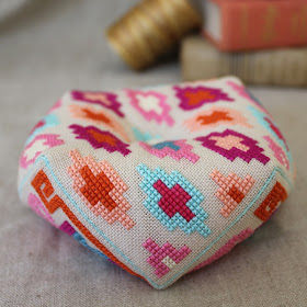 |
| Elephant Biscornu by Satsuma Street |
Here it's the saucy head of the momma bird in Happinest. Just as with the black background, the raw linen color is a nice neutral that doesn't affect the perception of 718:
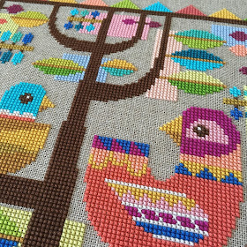 |
| detail - Happinest by Satsuma Street |
If you don't have DMC 718 on hand, the closest match is DMC 917, which they call "Medium Plum" (go figure). They are almost indistinguishable as far as I'm concerned. I use 917 constantly too, including here in the Pretty Little Hong Kong design, again paired with teal and gold:
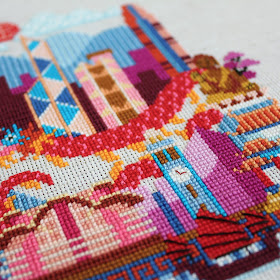 |
| detail - Pretty Little Hong Kong by Satsuma Street |
So, that's my little homage to DMC 718! It's fun to look back over my designs and see the same color used in many different ways.
Next time: DMC 3819!
xoxo
Jody


